


 Español
WPC Wall Panels Designs: Practical Styles, Specs, and Installation
News-Content
- 1
- 2 The most reliable WPC wall panels designs for modern interiors
- 3 Design families that actually change the feel of a room
- 4 Room-by-room guidance: what works and why
- 5 A spec checklist that prevents costly design mistakes
- 6 Installation details that protect the design (not just the panel)
- 7 Maintenance and longevity: keep the design looking new
- 8 Cost planning and how to get a premium look without overspending
The most reliable WPC wall panels designs for modern interiors
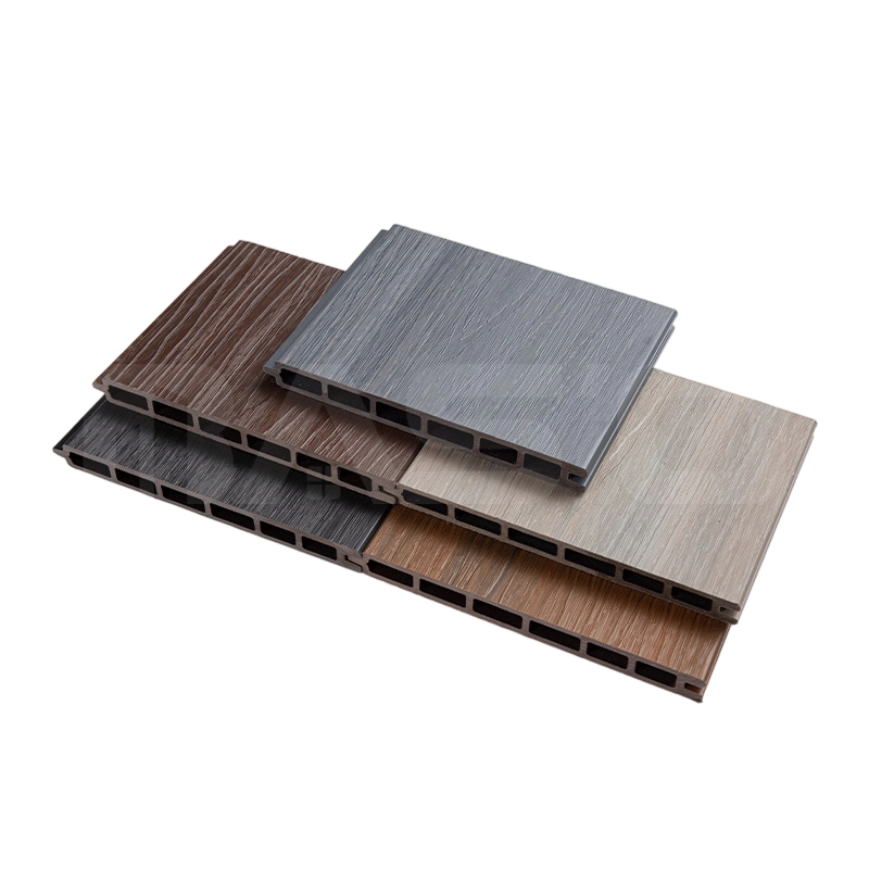
If you want a safe, versatile choice, prioritize matte wood-grain slats in warm neutrals (oak, walnut, ash) for feature walls and stone/concrete-look WPC panels in mid-gray for high-traffic areas. These WPC wall panels designs hide minor scuffs, pair well with common flooring colors, and stay visually “timeless” even as furniture trends change.
For most residential projects, a practical design rule is to use a statement texture on one wall per room (TV wall, headboard wall, entry wall) and keep surrounding walls simpler to avoid visual overload.
- Best “all-around” look: matte wood-grain slat panel + black/brushed metal trim lines.
- Best for tight spaces: light-toned panels with subtle grain (they reflect more light and feel larger).
- Best for busy family areas: textured finishes (micro-embossed wood grain) that camouflage fingerprints.
Design families that actually change the feel of a room
Most WPC wall panels designs fall into a few repeatable “families.” Choosing the right family is more impactful than chasing a niche pattern.
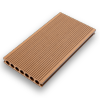
Slat (linear) designs
Slat panels create height and rhythm. Vertical slats visually raise ceilings; horizontal slats widen a narrow wall. If you plan lighting, slats pair well with grazing light because shadows enhance depth.
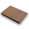
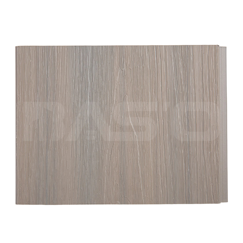
Wide-plank wood grain
Wide planks feel calmer than slats and work better in bedrooms or offices. A medium grain density is typically easier to match with furniture than high-contrast “cathedral” grain.
Stone / concrete look
These designs read “architectural” and tolerate scuffs. They suit entry corridors, stair walls, and commercial lobbies. The most convincing options have a low-sheen finish and slight texture to avoid looking printed.
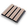
Geometric and 3D relief
Geometric patterns are strongest when used sparingly (small zones or framed panels). If your room already has patterned rugs or busy art, keep the wall panel relief shallow so it doesn’t compete.
Room-by-room guidance: what works and why
Matching panel design to room function reduces regret. Below are practical pairings that consistently look intentional.
Living room TV wall
- Choose: vertical slats or wide-plank wood grain in mid-tone.
- Detail: keep the TV area matte to reduce reflections; add a thin shadow-gap or trim for a “built-in” look.
Bedroom headboard wall
- Choose: warm neutrals with soft grain; avoid high-contrast patterns behind pillows and linens.
- Proportion: a panel zone sized to the bed width plus 150–300 mm on each side often looks balanced.
Kitchen / dining feature zones
- Choose: finishes that wipe clean easily; micro-texture is fine, deep grooves collect grease and dust.
- Placement: keep panels away from direct heat sources; use backsplash-appropriate materials where splatter is frequent.
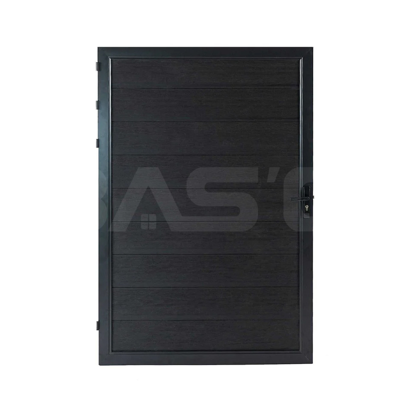
Hallways, staircases, and commercial areas
- Choose: stone/concrete looks or medium wood tones; they mask repeated contact points.
- Add: chair-rail height protection or a robust base trim if bags and shoes regularly brush the wall.
A spec checklist that prevents costly design mistakes
Great-looking WPC wall panels designs still fail if the specification doesn’t match the environment. Use this checklist to align aesthetics with performance.
Typical dimensions to plan around
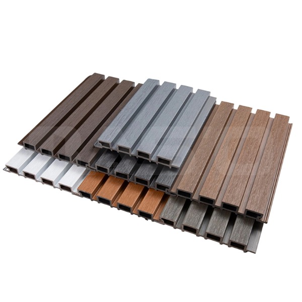
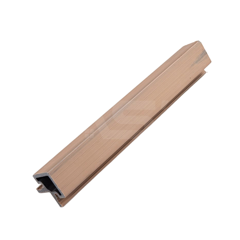
- Common thickness bands: ~8–10 mm (lighter) and ~15–25 mm (more rigid/3D profiles), depending on the panel structure.
- Visual rhythm: slat pitch (slat + gap) often lands in the 20–50 mm range; tighter pitch looks more “premium” but shows alignment errors more clearly.
Performance points to request from suppliers
- Fire performance: ask for the stated classification for your jurisdiction and the test standard used (do not assume all WPC panels perform the same).
- Water and humidity suitability: confirm whether the product is intended for interior dry areas, humid interiors, or semi-exposed locations.
- Surface durability: request abrasion/scratch guidance and cleaning restrictions (especially for glossy or printed finishes).
- Color consistency: ask for batch matching guidance; if ordering in phases, reserve extra panels to avoid shade drift.
| Design type | Best use | What it does well | Watch-outs |
|---|---|---|---|
| Matte wood-grain slats | Feature walls, TV walls | Adds depth; hides smudges | Needs accurate leveling to keep lines straight |
| Wide-plank wood grain | Bedrooms, offices | Calm, clean, easy to match | Large flat areas reveal wall waviness |
| Concrete/stone look | Hallways, stairs, lobbies | Masks wear; modern aesthetic | Glossy prints can look artificial under strong lighting |
| 3D geometric relief | Small zones, accent panels | High impact; decorative focal point | Can overwhelm rooms; collects dust in deep grooves |
Installation details that protect the design (not just the panel)
Many visual defects blamed on “bad panels” are actually alignment and finishing issues. These practices keep WPC wall panels designs crisp and consistent.
Wall preparation and layout control
- Snap control lines and dry-fit the first row/column; the first panel dictates the entire pattern alignment.
- If the wall is wavy, use a batten system or leveling method so slat shadows don’t “telegraph” unevenness.
Expansion planning
Composite materials can move slightly with temperature and humidity. A common best practice is to maintain a small perimeter gap (often in the ~2–5 mm range) that gets covered by trim, especially on long runs.
Finishing that looks intentional
- Use consistent edge detailing: shadow-gap, metal trim, or matching end caps—mixing edge styles reads unfinished.
- Plan outlets and switches early; misaligned cutouts are more visible on linear slat designs.
Maintenance and longevity: keep the design looking new
The right care routine protects both appearance and finish. In day-to-day use, panels usually look best when cleaned lightly and regularly rather than aggressively and infrequently.
Cleaning routine
- Dust first with a soft cloth or brush attachment; this prevents grit from acting like sandpaper during wiping.
- Use mild soap and water for most messes; test any cleaner on an off-cut to confirm it doesn’t dull the sheen.
- Avoid harsh solvents on printed or coated finishes unless the manufacturer explicitly permits them.
Design choices that age well
If longevity is the goal, prioritize matte or low-sheen textures, mid-tone colors, and consistent grain patterns. High-gloss finishes can show micro-scratches more easily under raking light.
Pricing varies by region and specification, but most projects become cost-effective when you focus spend on the wall people notice first and simplify everything else. A useful approach is: premium feature wall + standard adjacent walls + high-quality trims.
Where the budget actually goes
- Surface realism (embossing, texture depth) often costs more than color changes.
- Trims, corners, and end caps can materially affect the final look; plan them as part of the design, not as an afterthought.
- Installation quality is a major value driver for linear slat designs because misalignment is immediately visible.
A practical “sample test” before committing
- View a sample against your flooring and in your lighting (day and night).
- Touch the texture and check reflection; if it looks shiny in-store, it may look shinier at home.
- Confirm batch availability and buy extra material; keeping ~5–10% spare is commonly used to cover cuts, waste, and future repairs.
The simplest way to make WPC wall panels designs look custom is to align the panel pattern with architectural cues (centered on the TV, bed, or entry axis) and finish edges cleanly with a consistent trim strategy.
Our News //
Related News
-
Email: [email protected]
Email: [email protected] -
Tel: +86 13732382108
Tel: +86 18705821696 -
 BLDG#1, LONGOUANWU ECO-INDUSTRIALPARK, MIAOXITOWN, WUXINGDISTRICT. HUZHOU. CHINA
Quick Links
Products Center
Copyright © 2025 Huzhou Baosheng New Material Co., Ltd.All Rights Reserved. Composite Decking Manufacturers Composite Cladding Factory
